We recently released several great user interface design updates in Fleetio, and we’ve got several more in the pipeline. One of the things we enhanced is the usage chart on the Fleetio Dashboard.
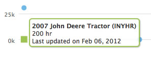
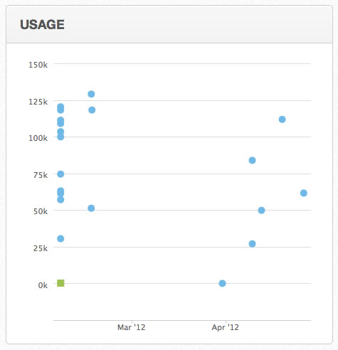
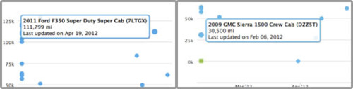
We moved away from just using basic bar chart and are now using a scatter plot to illustrate both the current meter value as well as the date the vehicle was last updated.
Why is this so great? Because now you can easily see which meter values might be “stale” because they haven’t been updated in a while.
You can still also quickly tell which vehicles or equipment have been used the most, just like you could on the bar chart.
We also designed the chart to use different color plot points for miles, kilometers and engine hours. That way mixed fleets can easily distinguish between the different types of equipment.