We’re rolling out improvements to Fleetio starting next week that simplify the way you get around your Fleetio account.
With so many new features added to Fleetio over the last few years, we decided it was time to rethink how you navigate between them. We’ve made some important changes to menus and navigation in the Fleetio Web App and want to make sure you know exactly what’s new. Look out for these changes the week of March 7th.
Improved navigation from the menu
We noticed that it was hard to find what you’re looking for with all the new and expanded features in Fleetio. Our new collapsable navigation menu makes it a lot faster to get where you need to go by nesting the most popular pages under their corresponding module. Just expand parts of the menu as you go to reveal more specific pages and click directly into them.
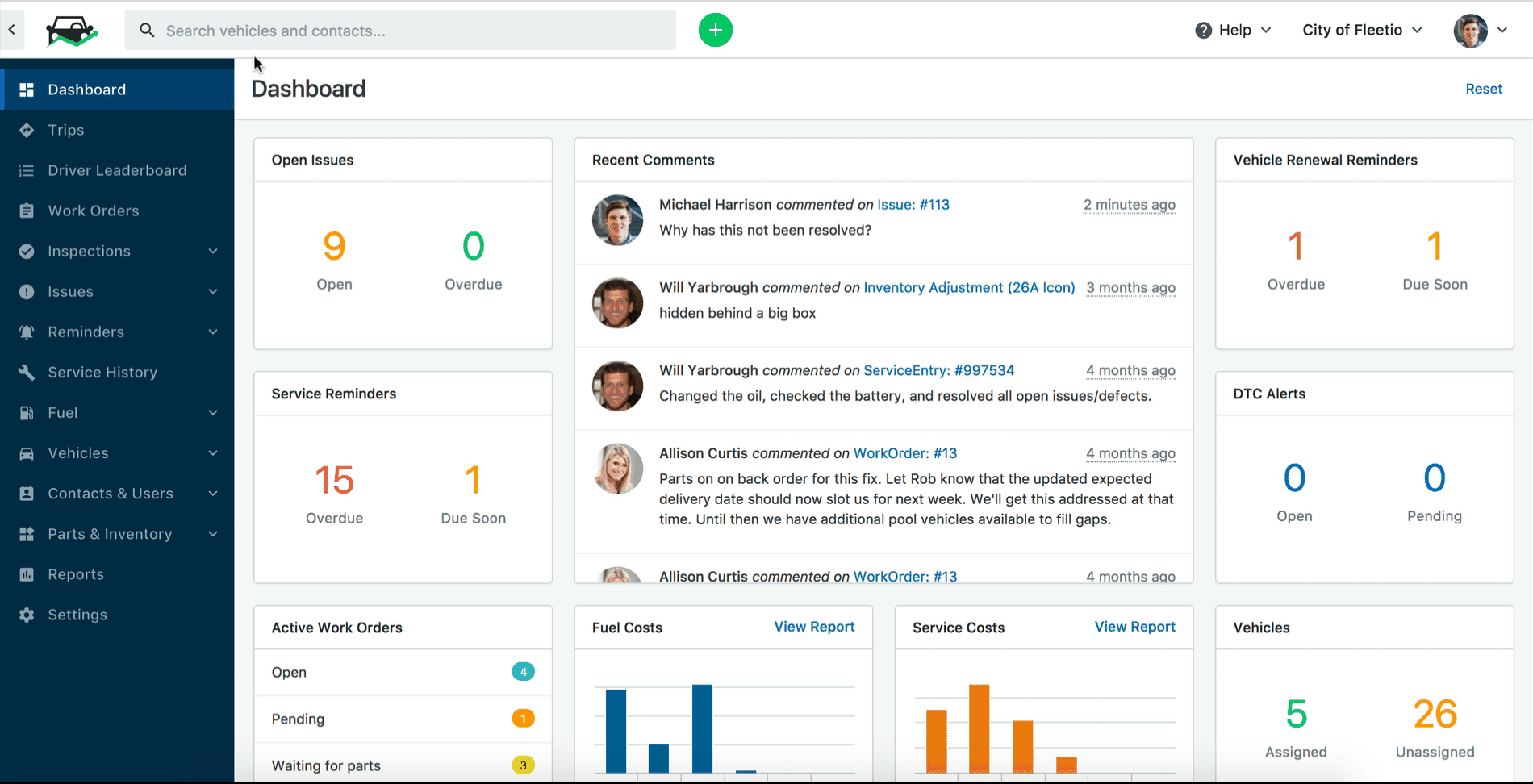
The entire menu also collapses giving you a large screen and workspace.
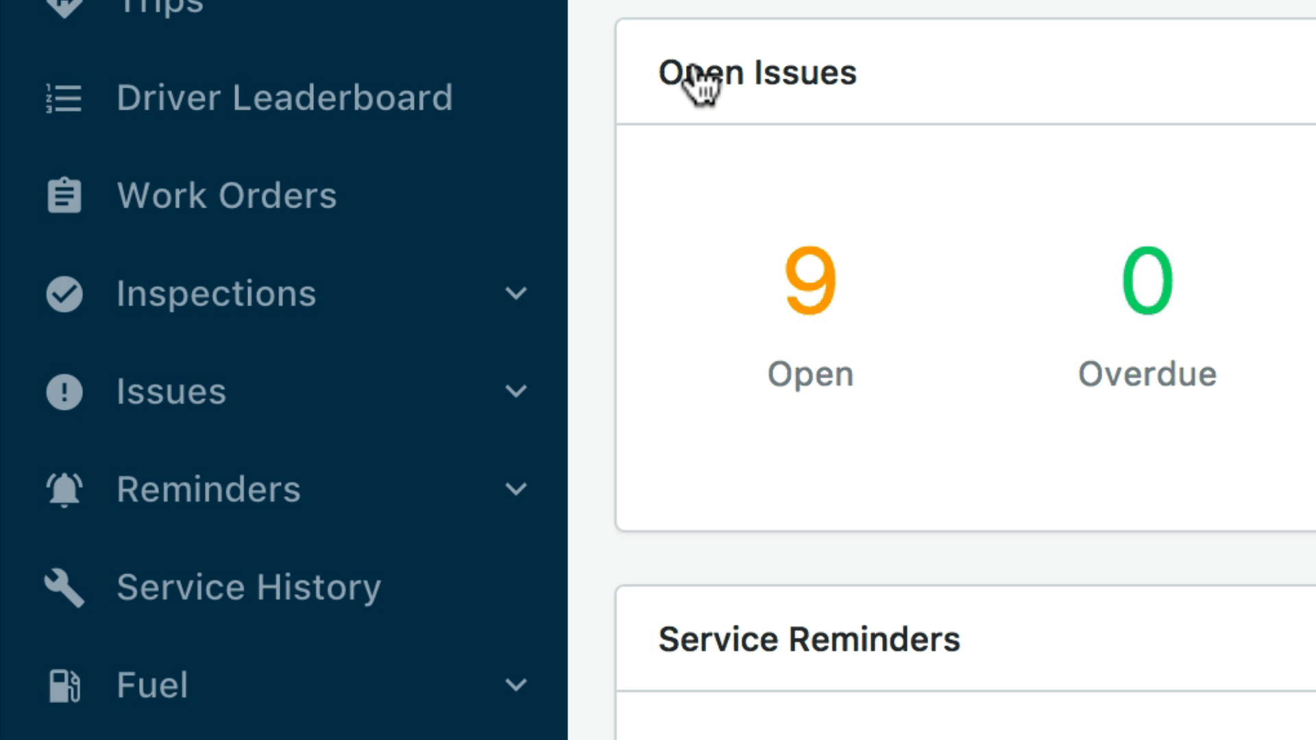
Improved data filtering
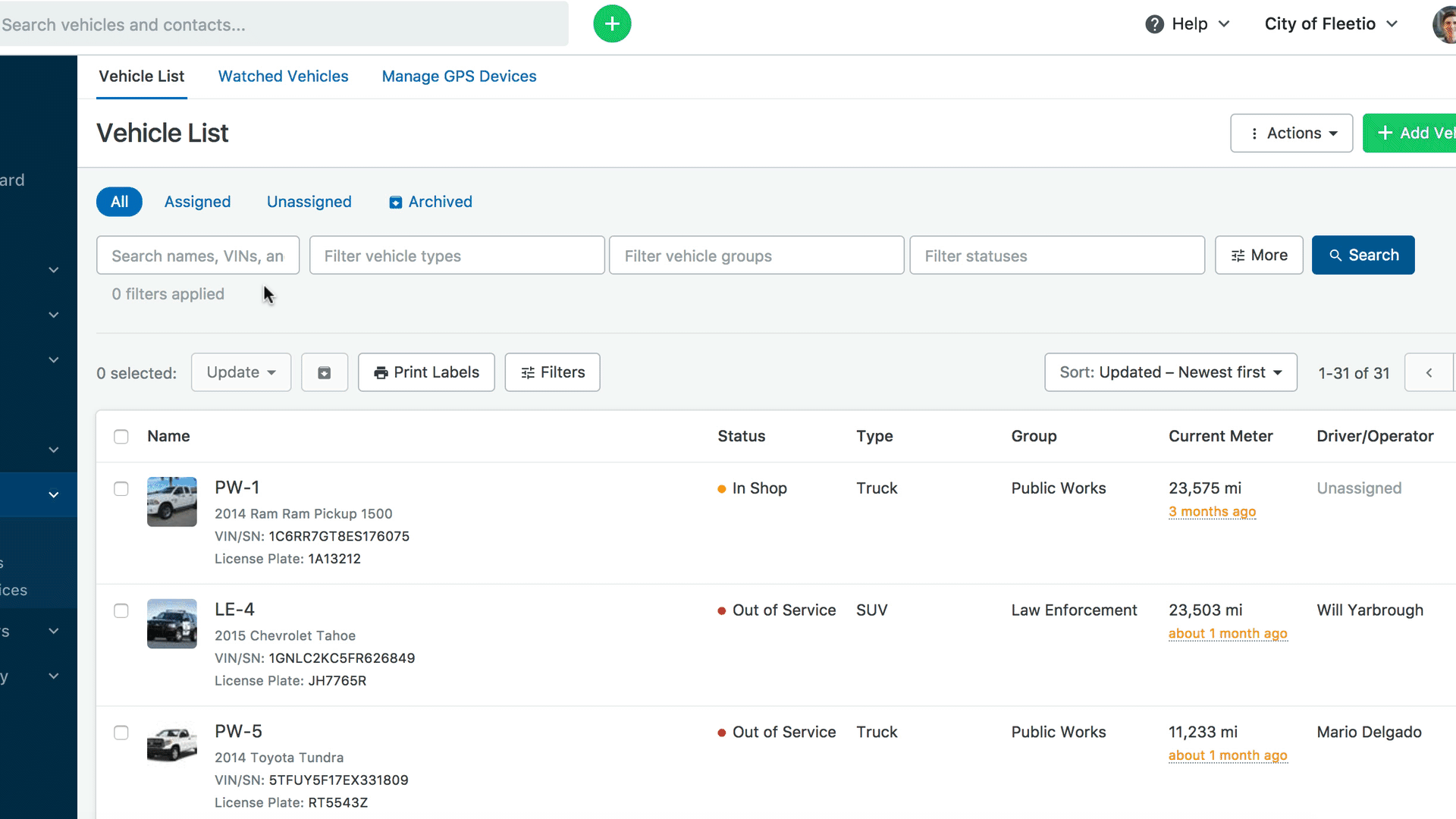
Instead of a fixed filtering menu that takes up valuable screen space on the right side, we’ve streamlined filtering through the use of "Main" filters and "More" filters.
Main filters
Main filters are shown in a row directly above a list or table on each page (where applicable). They allow you to filter data based on the most common filtering criteria such as specific vehicles or groups.
More filters
More filters are revealed when you click the “More” button in the row of Main Filters. These allow you to get more specific in your filtering technique using criteria such as vehicle details, assignments and custom fields.
Fleetio Tip:
On any screen that shows the More filters button, you can key the letter "F" on your keyboard to reveal those filters. Use the tab button to move through the fields and arrows to select items from a dropdown.
Realigned header bar
We’ve relocated a few items you might be using from the header bar. Don’t worry, they haven’t gone far!

Account dropdown
The account dropdown is the menu that is revealed when you click on your company’s name from the header bar. We’ve moved it from the left side of your screen, over to the right. You’ll find it next to the “Help?” button and your profile picture (or User Settings dropdown).
Settings
The Settings icon, formerly found in the top right of the header bar has moved to the main menu found on the left side of any page.
Users and Permissions
Managing your account’s users and permissions has moved to the main menu on the left side of your screen under Contacts. Click “Users” to manage roles, driver status, and individual access in Fleetio as you always have.
Search Box improvements
In the old search box, it was only possible to search vehicles in Fleetio. Now you can search contacts too. The search box is also much larger and it’s easier to read results on small screens.
Quick Add button
It’s still just as easy to add service entries, work orders, vehicles quickly. The handy Quick Add button moved to the right of the search box.
–
We hope you find these changes useful for efficiently navigating your Fleetio account. What do you think? Send us feedback!